Case Study
el toro loco grill
Overview
El Toro Loco Grill is a modern Mexican restaurant aiming to enhance its online presence with a sleek, user-friendly website. The goal was to create a visually appealing and intuitive online ordering experience while maintaining the restaurant’s vibrant and authentic brand identity.
Problem statement
The restaurant's previous online presence was either non-existent or outdated, leading to issues such as:
A lack of brand consistency and engagement
Difficulty in navigating the menu and placing orders
A non-responsive design that didn’t adapt well to mobile users
A need for a seamless, modern e-commerce experience
Goals
Enhance User Experience (UX): Ensure a smooth browsing and ordering experience for both desktop and mobile users.
Brand Alignment: Create a modern yet authentic look that reflects the restaurant's identity.
Mobile Optimization: Design a fully responsive site that provides an effortless experience on any device.
Encourage Online Orders: Improve call-to-action placements and streamline the ordering process.
research & Inspiration
Before starting the design, I analyzed:
Competitor websites to understand what works in the food industry
Modern UI trends in restaurant web design
User expectations for online food ordering
I also gathered inspiration from well-known brands like Chipotle and Taco Bell to blend aesthetics with functionality.
Design process
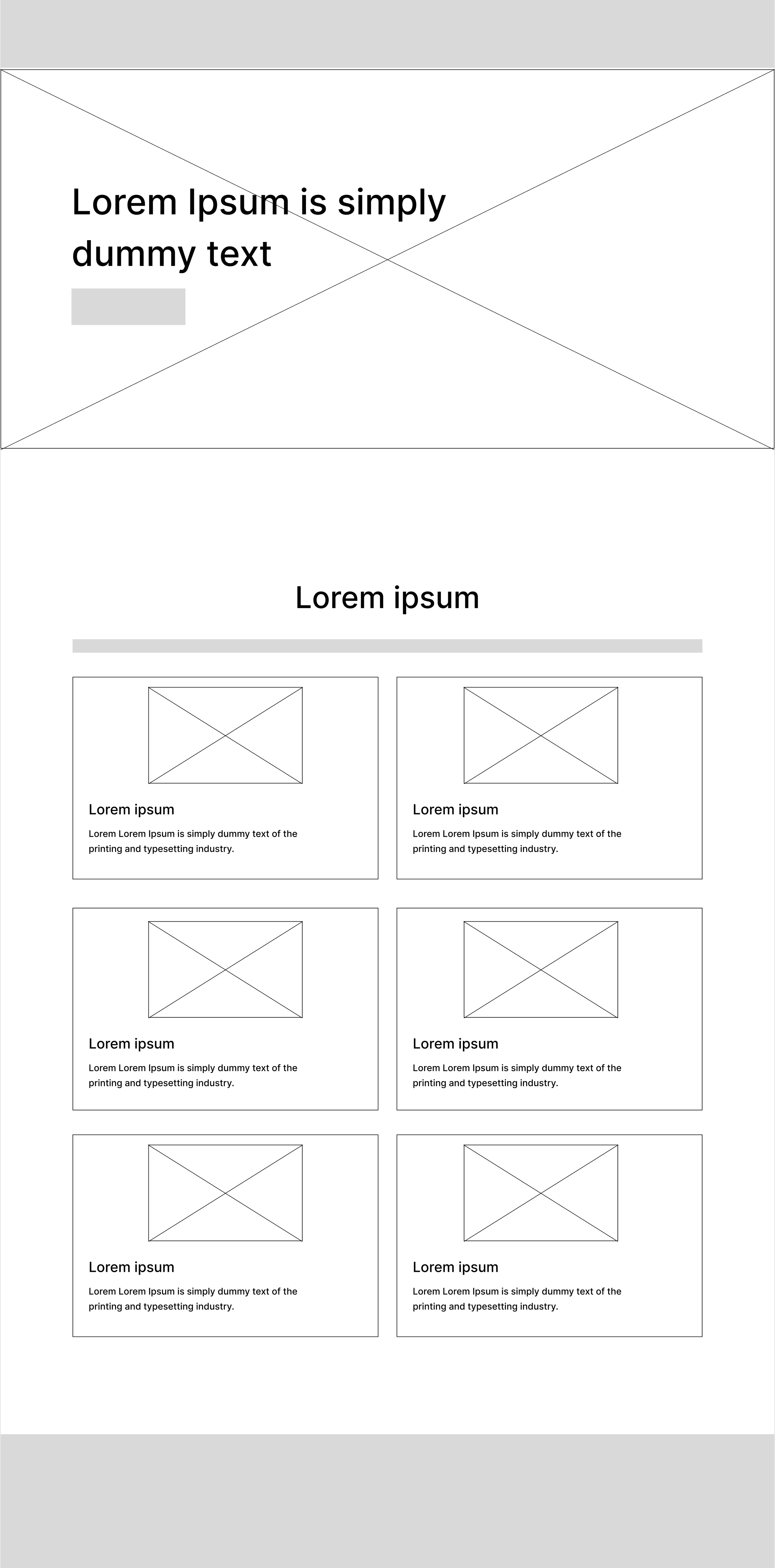
1. Wireframing & Layout
I started with low-fidelity wireframes to map out:
The homepage layout
The menu structure
The ordering flow
2. UI Design
Using Figma/Adobe XD, I created high-fidelity mockups that included:
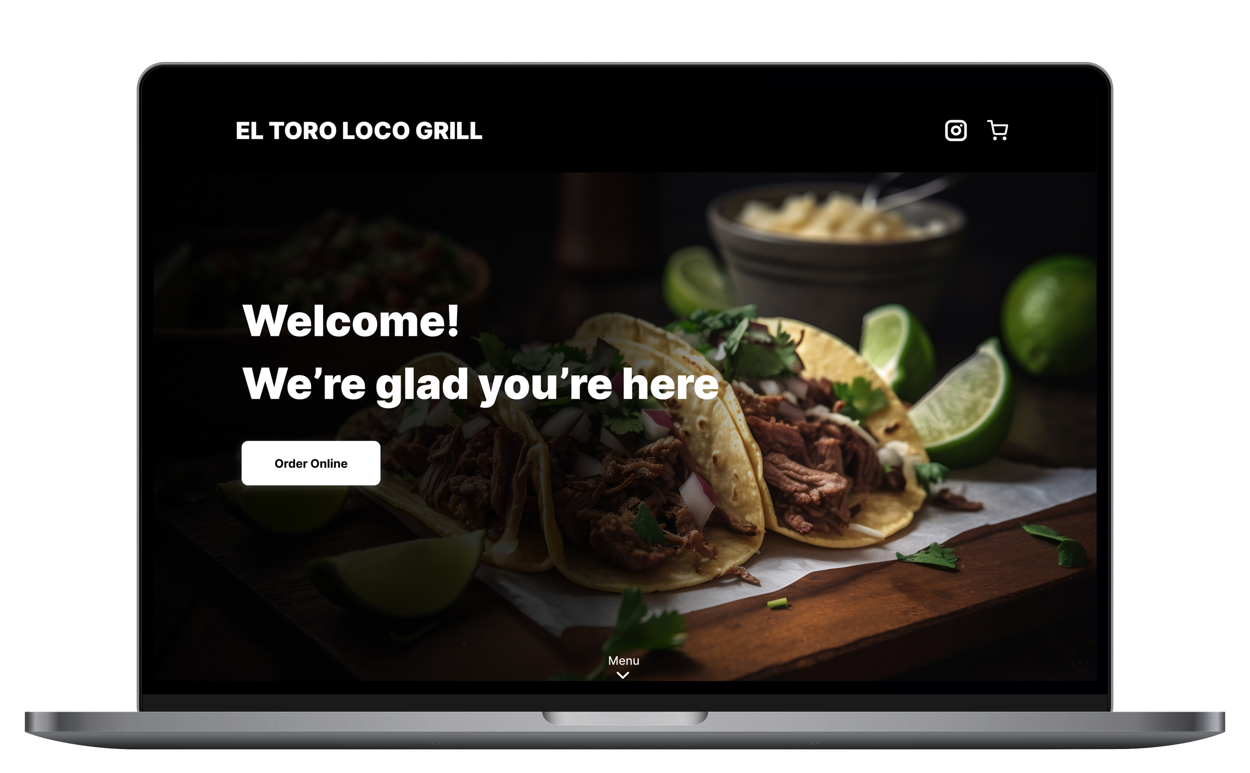
A dark-themed, modern aesthetic
High-quality food imagery
A clear visual hierarchy for the menu
Engaging call-to-action buttons ("Order Online")
3. Mobile-First Approach
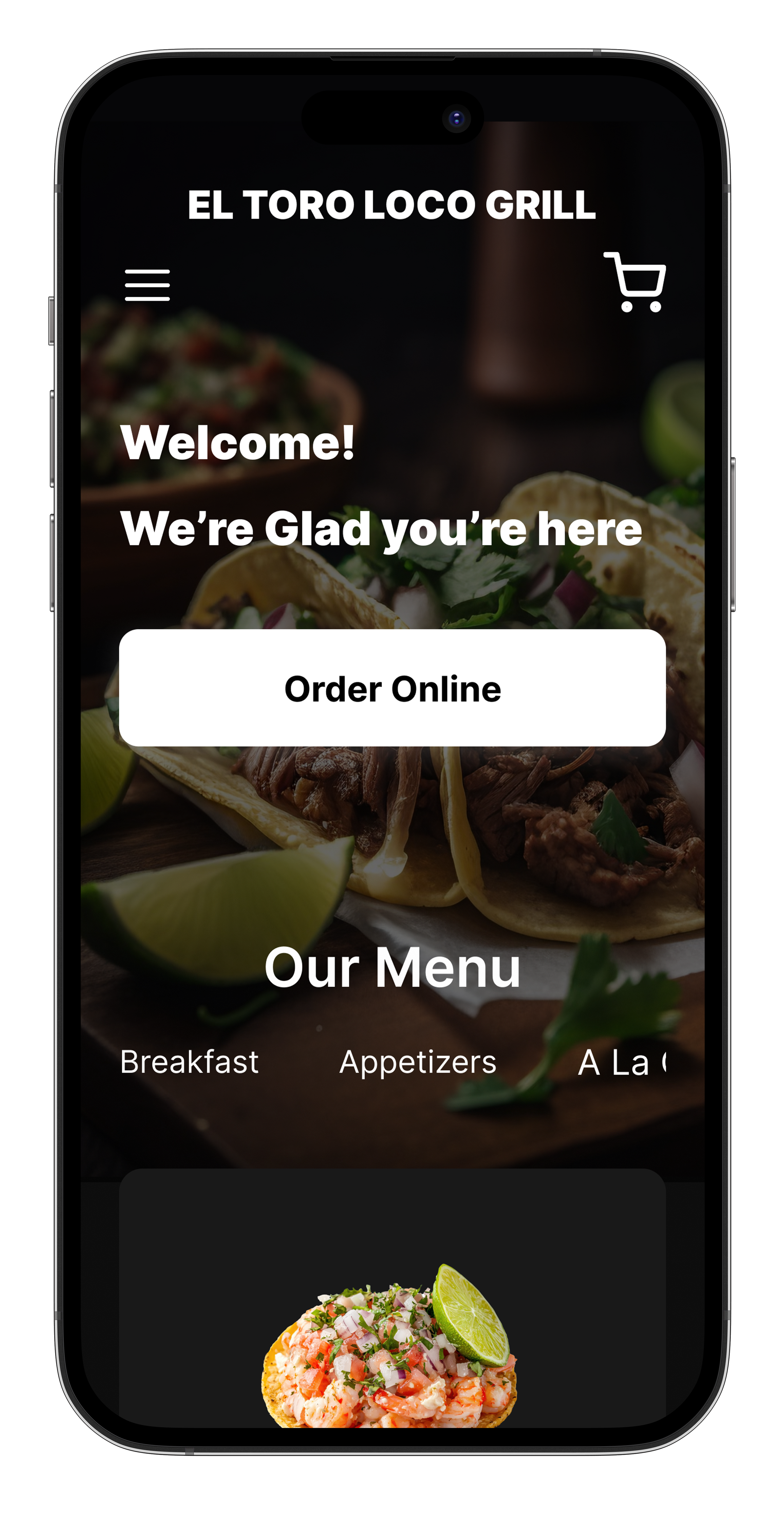
Given that most users would browse via mobile, I focused on:
A seamless menu browsing experience
Optimized touch-friendly buttons and interactions
A clean, scroll-friendly design
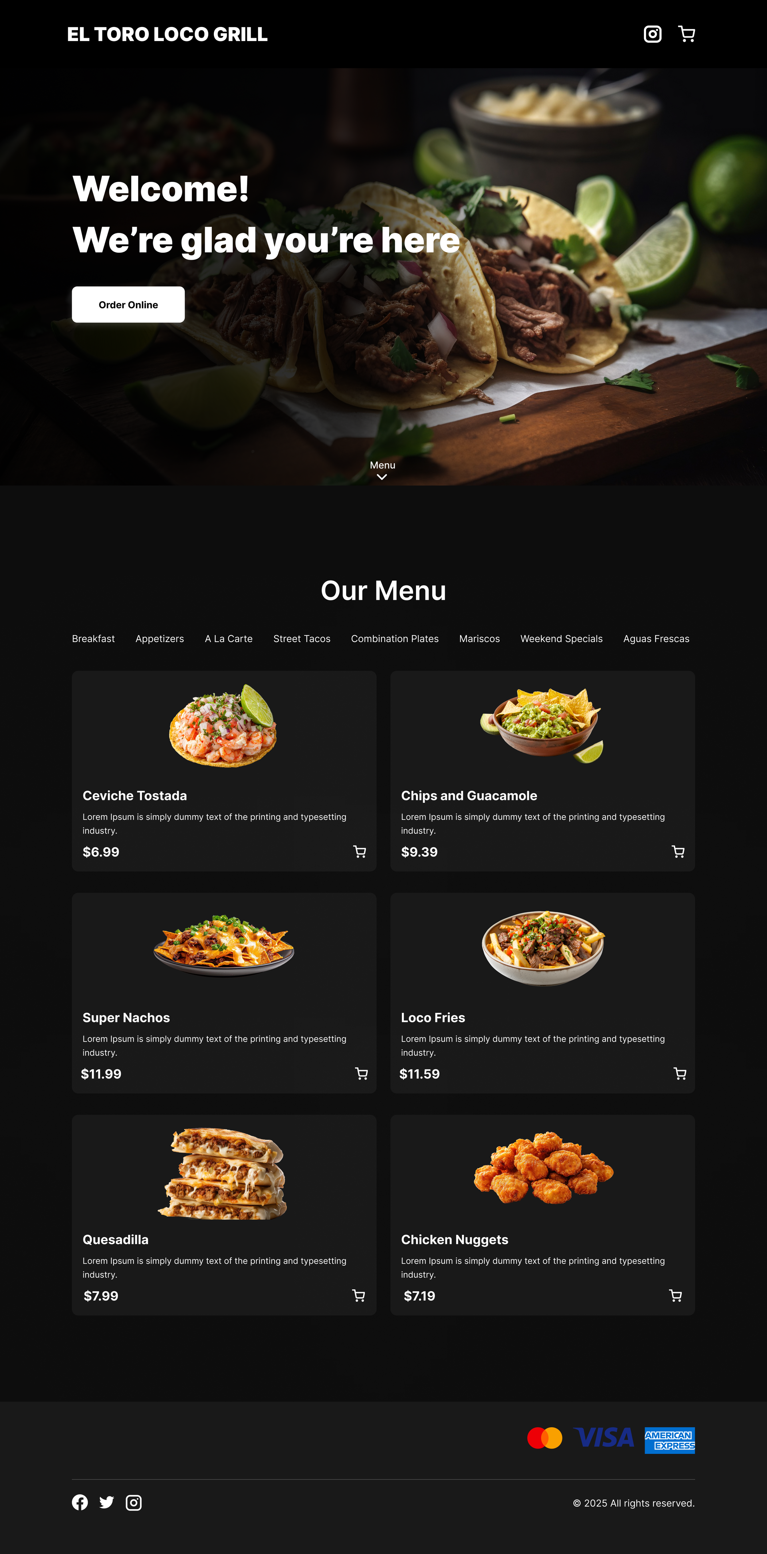
Final design
The final design consists of:
A welcoming hero section with enticing food visuals and a prominent "Order Online" CTA
A categorized, easy-to-navigate menu
A sleek, minimal shopping cart integration
Secure payment options showcased at the bottom
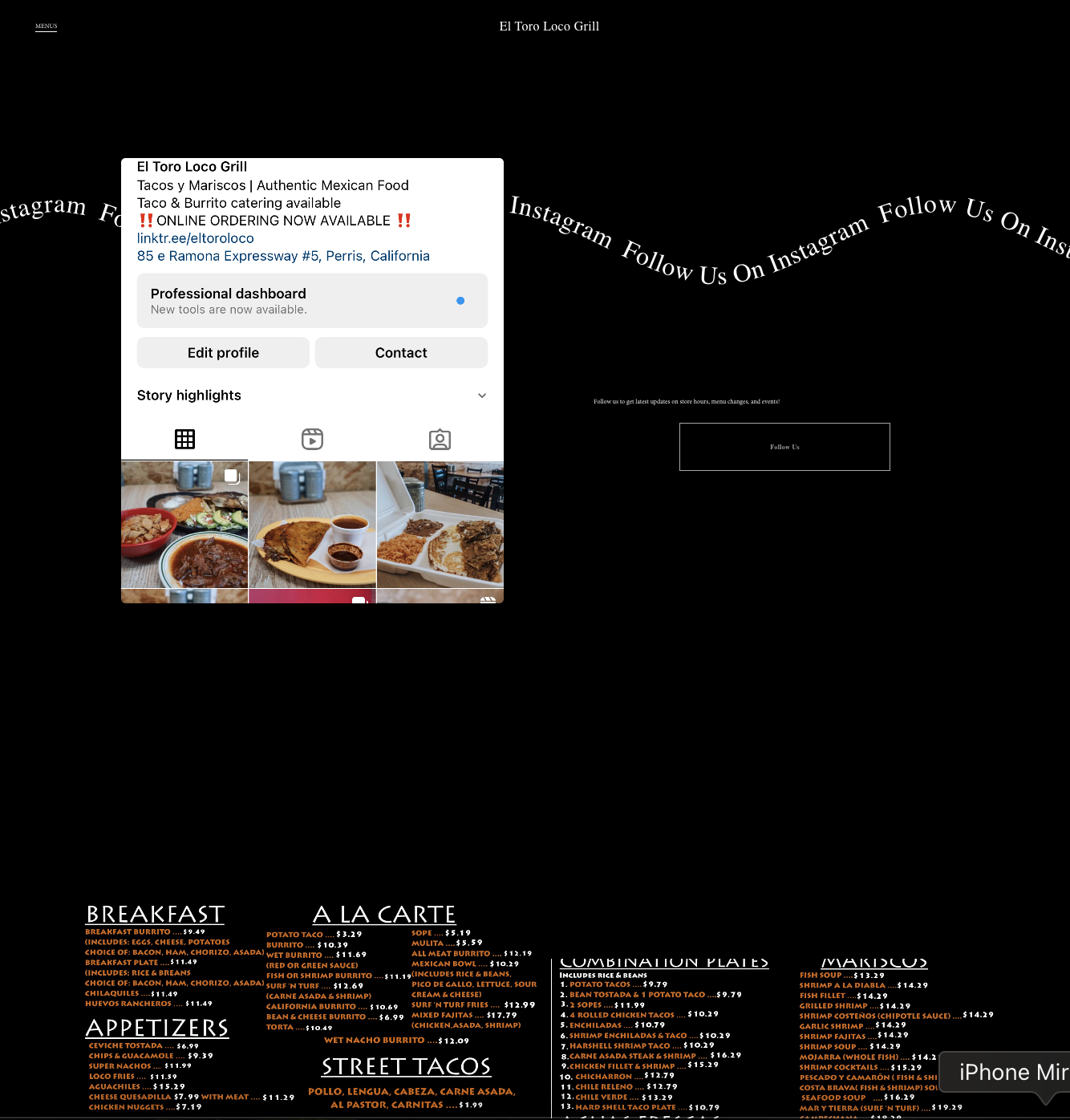
Social media integration for brand engagement
Results & next steps
This redesign lays the groundwork for:
Increased online orders and customer engagement
A strong, recognizable digital presence
Potential development into a fully functional e-commerce platform
Moving forward, the next step would be collaborating with developers to bring this design to life using Webflow, Framer, or WordPress with WooCommerce.

